
MoTR Production Update: Week 5
- 1rregularcharlie

- 6 days ago
- 6 min read
AHOY EVERYBODY!
Lots of bits and peices to go over this week so let's get cracking right away.
Annecy MIFA Application
Around Christmas we created this website and put together a little pitch deck to apply to the Annecy: MIFA Pitch Scheme. We had really hoped for the chance to present Member of The Revelry on a stage because we really believe we've struck gold here.
Alas, twas not to be.
At least this year. ;D
The moderators had over 880 projects to consider for this chance so we do not envy them their task. Our intention now is to apply again next year. The rules specifically state that only a project that has ungone "signifcant" change will be considered if it's a resubmission. I won't lie, frequently since Christmas I wished I could go back and update the pitch deck we submitted. You need only look at these production blog posts to see how much progress and change the project has ungone. For the better I'd say.
So whilst disappointing, we're still sailing. Member of The Revelry will be a success someday, even if the seas and waves be choppy and the squalls and gusts brutal, we're dedicated to this project and bringing our piraty, transgender story of hope to you.
Current Status
General
The Design guide is so close to being complete but as always as we're developing aspects of that we're realising some things are in need of tweeking and updating. It can be a pain in the bum but such is the nature of this kind of project.
Model Sheet updates
Thought we were done updating the modelsheets!? So did we! Alas as we worked on creating the posesheets for The Froces of Darkness and Mr Campus we realised some serious alterations were needed to the modelsheets. Some more than others.
Mr Campus

Mr Campus is by no means a major character in the series but is still a vital part of The Revelry crew. As we worked on the Campus, Eliot and Cassettel posesheet (we'll get to that) it became apparent to me that his design had shifted somewhat like the rest of the crew. I had previously (foolishly) thought that his design hadn't changed much as the series style has settled. Thus it was time to redraw his modelsheet.
As you can see in the above image, his back fin was increased, head size increased, shoulders and arms lowered, body made overall chunkier, eye increased in size and ears stretched. A lot of these changes were made because they represent points of characterisation and expressiveness (his eyes and ears). He remains a somewhat complex character to draw in comparison to the rest of the crew but I really enjoy his odd design and horse-like features.
The Forces of Darkness
The "bad guys" of the first (or atleast episode 1) we called The Forces of Darkness. In The Seas Between they would be consider Shades; barely coherent spirits of The Dream who react more on instict than tangible thought. Essentially, they're the fodder of those that oppose our heros; The Revelry.
Our orginal designs for them were bright. Their mindlessness was symbolised through their swirly scribbly eyes. What we found however was that these designs didn't really fit what they're meant to represent, and that their primary feature used to convey emotion would be difficult to consistently draw correctly in animation. Thus we decided to update these aspects of their designs.
Across the board we decided to desaturate the colours to fit their more "hollow" lore, and we updated their eyes to me a more classic single cartoon eye with a single hollow circle acting as their pupil. The hollowness of the circle again representing their unrealised existences.


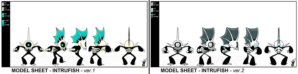
In the case of The Statigue and Intrufish designs we decided to rework them slightly. The Statigue was made overall chunkier to fit the style of the series and the Intrufish had their head grown, made more circular and their limbs and claws extended.

Whilst the brighter designs certainly elicit great attention the more subdued desaturated designs fit their story concepts far closer I feel. It also creates a more obvious visual gap between The Revelry and their opposition The Forces of Darkness.
The Design Guide
The design guide has been my primary focus for the past week and I can (hopefully) say it's almost complete. Well, as complete as a constantly updated document can be. :P
Expression Sheets
The majority of expression sheets were completed last week but we did miss a few.
Mr Campus

For some reason I straight up forgot to upload Mr Campus' expression sheet in the last post. Let's fix that now! Campus is actually a very fun if not tricky character to draw expressions for. Primarily because his design is more complex than other members of The Revelry. It was fun to include his ears in his expressions as well as play around with symbol pupils.
The Forces of Darkness

As I mentioned earlier, I foolishly thought that The Froces of Darkness wouldn't really be doing much in the way of expression and thus could maybe be skipped in terms of creating an expression sheet for them. What a fool I was.
In this sheet it was important for me to show how a single eyed creature can still be expressive.
The Pose Sheets
This is where the majority of my time was spent the last week or so. In the interest of creating poses we decided to make the pose sheets focus on interactions between certain character groups. Last week we saw the sheet for Hawkins and The Powder Monkeys. This week we have even more group character posesheets.
Eliot, Cassettel and Campus Pose Sheet

It was the work on this posesheet that made it very apparent to me the need to update Mr Campus' modelsheet.
With that said I really enjoyed drawing this and I love that the end results accurately portray the relationship between these three. My favourite is the one of Eliot somehow getting his sword head stuck in the ground and the other two laughing their collective bums off.
Reveller and Lamenter Pose Sheet

As yes, these two. It was a no brainer putting these two together (for shipping reasons).
Obviously I had to draw a pose of the pair slow dancing yet again but I also had a lot of fun displaying how Lamenter "runs" and how Reveller's lower legs bend. To that end it was important that I draw Reveller squatting.
The Forces of Darkness Pose Sheet

It was working on this posesheet that prompted me to update the modelsheets of all of The Forces of Darkness. It was important to me that whilst these creatures be a little... stupid, they're still expressive.
The crew very quickly fell in love with these goobers upon finishing this sheet.
Hand Sheets
Hand sheets are something I hadn't truly considered all that extensively before begining the design guide but I must admit, hands are a vital part of nearly every design and one of the most expressive parts of every character. So again, such a fool was I.


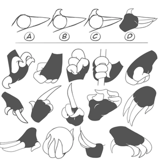
Above are the 3 handsheets made for the general hands found in the MoTR designs.
The instructions at the top are heavily inspired by a hand sheet created by Preston Blair I saw many years ago and have been referring to ever since.
The 3 fingered design is used by most the members of The Revelry whom have hands; Reveller, Potas, Carbo and Sulfu.
The 4 fingered design is used exclusively by Hawkins. This is another subtle design cue to indicate their different nature to the others. Hawkins is after all, human.
The last is the more clawed 3 fingered design used by Lamenter and The Forces of Darkness. The trick with these is still creating space on the hands for linework that helps empasise the hand. By which I mean; the majority of characters using this design have a heavy focus on black in their designs, which obviously blends into their outlines. Thus, where a bump needs to be included in the hand, it should be added with a white line.
3D Modelling


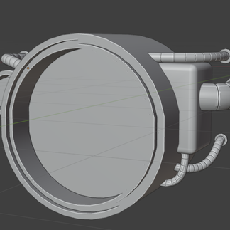


Katherine's working hard as always whenever she can. We're really happy with how the ship is coming together slowly but surely. Lots of small little details. She also managed to model and texture the engine for a class assignment. The engine isn't texture style we've established for the serious, that was just a part of the assignment, but it still looks great so I wanted to show off her talents.
The Coming Week
1rregularCharlie
Finish the Design Guide. Make a shot list and prepare the files for the rough animation of the 2nd short. Play Mouse: PI for Hire, it comes out tomorrow. Myself and Natka did animation work on it. :D


Comments